How to Achieve a 90+ Mobile Core Web Vitals Score on React and Next.js Apps
To achieve a 90+ Mobile Core Web Vitals score on React and Next.js, optimize your critical rendering path by using server-side rendering (SSR) or static generation, applying strict code splitting via dynamic imports, leveraging specialized framework components and deploying code to edge-native networks with optimized caching topologies.
Table of Contents
-
The Mobile Performance Crisis in Modern JavaScript Frameworks
-
Decoding the Mobile Core Web Vitals Framework
-
Largest Contentful Paint (LCP)
-
Interaction to Next Paint (INP)
-
Cumulative Layout Shift (CLS)
-
Core Web Vitals Performance Benchmarks
-
-
Next.js Performance Best Practices for Mobile Optimization
-
Moving Beyond Client-Side Hydration
-
Optimizing the LCP Element with
next/image -
Eliminating Font and Script Bottlenecks
-
-
React Website Speed Optimization Strategies
-
Implementing Route-Level and Component Code Splitting
-
Taming the Main Thread to Improve INP
-
-
Designing High-Performance Networks: CDNs and Edge Computing
-
Infrastructure Security and Crawler Accessibility
-
Case Study: Optimizing a Next.js E-Commerce Mobile Platform
-
Common Technical Optimization Mistakes
-
Core Performance Optimization Tools
-
Core Web Vitals Implementation Checklist
-
Frequently Asked Questions (FAQs)
-
Conclusion and Actionable Next Steps
The Mobile Performance Crisis in Modern JavaScript Frameworks
Many engineering teams deploy sleek, component-driven React or Next.js applications, only to find their organic visibility dropping due to a poor Mobile Core Web Vitals score. While a site may load instantly on a high-spec development laptop connected to office Wi-Fi, the real-world mobile index experience is often completely different.
Google evaluates your site using low-to-mid-tier mobile hardware over a throttled 4G network connection. On mobile devices, heavy JavaScript bundles create a major performance bottleneck. The main thread becomes tied up parsing, compiling, and executing client-side scripts, which triggers long input delays and causes layout shifts.
When your mobile user experience metrics decline, your visibility within Google Search drops as well. To counter this, enterprise teams must move away from rigid platforms and adopt custom frontend engineering, as generic templates often run into severe limitations explained in our guide on Why WordPress and Ready-Made Templates Are Limiting Your Enterprise SEO Growth. Resolving these performance issues isn’t just about polishing code; it is a vital step for protecting your search traffic as search behaviors evolve.
Decoding the Mobile Core Web Vitals Framework
Google uses three core metrics to quantify user experience. To pass the mobile assessment, your application must cross strict thresholds for at least 75% of your actual visitors, a data pool tracked by the Chrome UX Report (CrUX).
Largest Contentful Paint (LCP)
LCP tracks website loading speed by measuring when the largest visual element within the viewport (such as a hero image or main heading) becomes visible. In React and Next.js sites, poor LCP is typically caused by unoptimized images, slow server response times (TTFB), or client-side rendering engines that delay content display until the entire bundle executes.
Interaction to Next Paint (INP)
INP measures visual responsiveness across a user's entire visit. It tracks the delay between an action—like a click, tap, or keypress—and the next visual screen update. Heavy hydration patterns and long-running JavaScript tasks frequently cause high interaction delays in single-page applications. Understanding this metric deeply is crucial, which we break down in What is Google’s New INP Metric (And How It Impacts Your Search Rankings)?.
Cumulative Layout Shift (CLS)
CLS measures visual stability by tracking unexpected element movement during page load. Dynamic content injection, ad units without fixed dimensions, and late-loading web fonts are the primary drivers behind high layout shift values.
Core Web Vitals Performance Benchmarks
| Metric | Good (Green) | Needs Improvement (Orange) | Poor (Red) |
| Largest Contentful Paint (LCP) | $\le$ 2.5s | 2.5s – 4.0s | > 4.0s |
| Interaction to Next Paint (INP) | $\le$ 200ms | 200ms – 500ms | > 500ms |
| Cumulative Layout Shift (CLS) | $\le$ 0.1 | 0.1 – 0.25 | > 0.25 |
Next.js Performance Best Practices for Mobile Optimization
The Next.js framework includes excellent built-in optimizations, but achieving a green mobile score requires configuring these primitives correctly to protect your traffic from algorithm shifts, a strategy outlined in How to Protect Your Website Traffic from Google AI Overviews.
Moving Beyond Client-Side Hydration
Relying heavily on client-side data fetching via useEffect hooks delays page rendering. The browser has to download the bundle, execute the framework engine, and then request the data API.
Migrate your pages to the Next.js App Router to use Server Components by default. Server Components fetch data directly on the server, sending pre-rendered HTML down to the device. This approach eliminates initial hydration overhead and improves your LCP timeline.
Optimizing the LCP Element with next/image
Images are the most common source of LCP delays. Standard HTML <img> tags often force mobile devices to download oversized assets. The Next.js Image component automates modern image handling:
import Image from 'next/image';

export default function HeroBanner() {
  return (
    <div className="hero-container">
      <Image
        src="/assets/hero-mobile.webp"
        alt="Optimized Hero Banner"
        width={390}
        height={250}
        priority
        sizes="(max-width: 768px) 100vw, 50vw"
        className="object-cover"
      />
    </div>
  );
}
-
The
priorityAttribute: Adding this tag injects a high-priority resource hint (fetchpriority="high") into the HTML header, telling the browser to download the image immediately. -
The
sizesAttribute: This ensures the server provides a correctly scaled image matching the mobile viewport layout width, preventing wasted cellular data.
Eliminating Font and Script Bottlenecks
Third-party font files frequently cause layout shifts when standard text styles are replaced by late-loading web fonts. Use next/font to host font files locally within your application bundle. For external tracking scripts, use the next/script component paired with a lazyOnload or worker strategy to move execution off the main thread.
As search platforms shift towards advanced search intent matching, aligning your script loading patterns with modern ChatGPT Search And Gemini SEO: How To Optimize For AI Search Engines methodologies ensures that heavy analytical tags do not delay the initial text parsing required by AI bots.
React Website Speed Optimization Strategies
If your application uses a decoupled single-page architecture, transitioning to advanced layouts like decoupling your frontend from backend data streams provides massive benefits, explored heavily in What is Headless Architecture? The Ultimate SEO Advantage for E-commerce Platforms.
Implementing Route-Level and Component Code Splitting
By default, bundlers pack your entire application into a single JavaScript file. When a mobile user opens your homepage, their device shouldn't have to download code for the checkout page or the admin dashboard. Wrap your routes and heavy components using React.lazy and Suspense:
import React, { lazy, Suspense } from 'react';

const DynamicAnalyticalChart = lazy(() => import('./components/HeavyChart'));

export default function ProductView() {
  return (
    <section className="layout-wrapper">
      <div className="primary-content">
        <h1>Product Specifications</h1>
      </div>
      <Suspense fallback={<div className="shimmer-placeholder" />}>
        <DynamicAnalyticalChart />
      </Suspense>
    </section>
  );
}
This ensures the browser only requests the code needed for the initial view, reducing your main thread blocking time.
Taming the Main Thread to Improve INP
High INP values occur when long-running JavaScript execution delays user interaction handling. To keep input latency below 200ms, break up long technical tasks using the useTransition hook:
import { useState, useTransition } from 'react';

export default function SearchFilter() {
  const [isPending, startTransition] = useTransition();
  const [filterResult, setFilterResult] = useState('');

  function handleSearch(e: React.ChangeEvent<HTMLInputElement>) {
    const value = e.target.value;

    startTransition(() => {
      const computedData = heavyDataProcessing(value);
      setFilterResult(computedData);
    });
  }

  return <input type="text" onChange={handleSearch} />;
}
Using startTransition tells React that updating the UI list is a low priority, allowing real-world user taps and keystrokes to take precedence.
Designing High-Performance Networks: CDNs and Edge Computing
The network layer plays a massive role in mobile page speed optimization. If a mobile request has to travel halfway across the globe to reach your origin server, your LCP will suffer. This becomes especially true when running data-heavy platforms scaling thousands of localized pages dynamically, a strategy we map out in our Introduction to Programmatic SEO: How to Scale Thousands of Pages via Smart Database Routing.
By hosting your React or Next.js application on an edge-native provider like Vercel or routing traffic through Cloudflare, you distribute application logic across global data centers. Using Edge Computing lets you run middleware functions right next to the user. This approach reduces Time to First Byte (TTFB) to double-digit milliseconds, paths data via efficient HTTP/3 protocols, and applies Brotli compression to assets before they are sent over mobile networks.
Infrastructure Security and Crawler Accessibility
While tuning frontend code is essential, your infrastructure architecture directly determines how search engines access your site. When structuring massive enterprise sites, selecting the proper directory pathing is a foundational pillar, which we analyze in Subdomains vs. Subfolders: Designing the Perfect URL Architecture for Enterprise Scaling.
Furthermore, aggressive network configurations can accidentally block search bots. For a comprehensive look at balancing safety with search engine discoverability, read our guide on How Cyber Security Defenses and Firewalls Impact Search Engine Crawlability. Similarly, if your performance issues stem from outdated internal systems, learning how a modern stack handles migration is essential, as detailed in Legacy ERP Migration: How to Shift to Cloud Infrastructure Without Losing Organic Rankings.
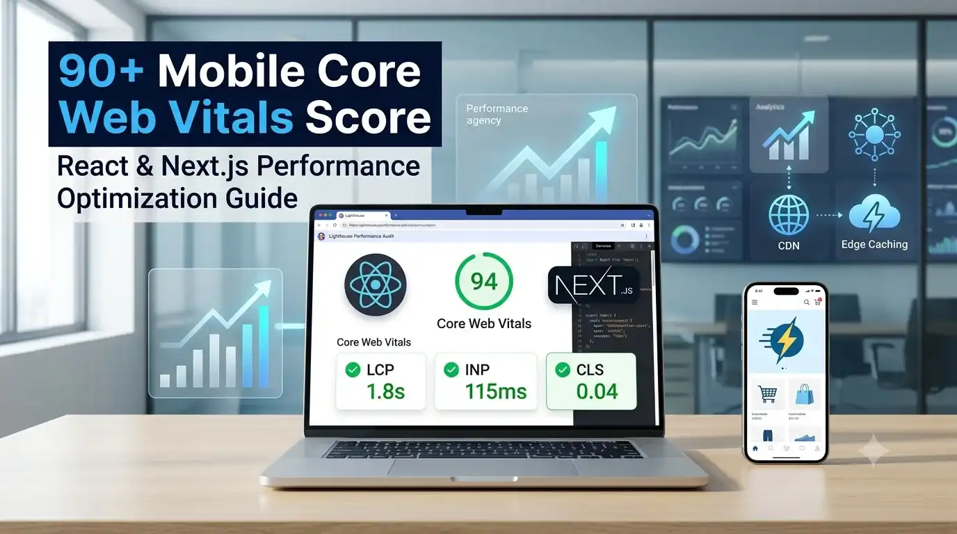
Case Study: Optimizing a Next.js E-Commerce Mobile Platform
Let's look at a real-world optimization scenario involving a large online storefront built on a traditional React single-page architecture.
The Challenge
The storefront suffered from low search visibility and high mobile cart abandonment. While their desktop performance ran smoothly, their mobile Lighthouse audit score sat at 38.
The Solution
The engineering and technical SEO groups executed a structured performance overhaul:
-
Framework Migration: They migrated the application to the Next.js App Router to leverage Server Components and static page rendering.
-
Asset Restructuring: They replaced inline styled-components with utility-first CSS to reduce runtime style recalculations, and forced aspect ratios on container modules to fix layout shifts.
-
Network Enhancements: They moved global deployments onto Vercel and routed domain management through Cloudflare for faster edge delivery.
Performance Improvements
-
LCP: 5.2s ──► 1.8s
-
INP: 480ms ──► 110ms
-
CLS: 0.31 ──► 0.04
-
Overall Lighthouse Mobile Score: 38 ──► 93
Business Impact
90 days after launching the update, the platform recorded a 34% growth in mobile organic traffic driven by improved rankings in Google Search. Additionally, their mobile conversion rate grew by 22% due to cleaner layout stability and faster page interactions.
Common Technical Optimization Mistakes
-
Relying purely on laboratory tools: Relying only on simulated Lighthouse tests can mask performance bugs that real-world mobile users encounter. Always cross-check your laboratory findings against field metrics inside Google Search Console.
-
Overloading client context: Wrapping entire application layouts in monolithic React Context providers forces sweeping component re-renders on minor state changes, which spike your mobile INP.
-
Failing to define font-display fallbacks: Leaving web fonts unoptimized causes noticeable layout shifts when text styling snaps into place on slower networks.
Core Performance Optimization Tools
1. Web Page Test
An expert performance testing engine that lets you run multi-step audits on actual mobile hardware across real regional communication networks.
2. Next.js Bundle Analyzer
A visual bundler plugin that identifies oversized NPM dependencies, helping you keep your asset footprint lean.
3. Chrome DevTools Performance Panel
A browser-native profiling tool used to find long-running tasks, record interaction delays, and resolve hydration mismatches.
Core Web Vitals Implementation Checklist
-
[ ] Page templates use Server-Side Rendering (SSR) or Static Site Generation (SSG) for above-the-fold content.
-
[ ] The main above-the-fold image uses a high fetching priority tag (
fetchpriority="high"). -
[ ] Explicit width and height attributes are applied to all media containers to maintain layout stability.
-
[ ] Bundle sizes are regularly inspected using a visual breakdown analyzer tool.
-
[ ] Layout recalculations are limited by avoiding expensive runtime CSS-in-JS injections.
-
[ ] Next-generation asset formats like WebP or AVIF are served by default.
-
[ ] Automatic code execution thresholds are enforced using integrated Lighthouse CI pipelines.
-
[ ] Page building architectures are built out with optimized server network layers to scale smoothly.
-
[ ] Global caching strategies are optimized to support modern discovery trends, keeping technical architecture in sync with advanced automated search routines.
Conclusion and Actionable Next Steps
Achieving a 90+ Mobile Core Web Vitals score requires a disciplined approach to asset weight and thread management. Start by migrating layout containers into Server Components to reduce client-side code. Next, use fixed aspect-ratio layouts to eliminate layout shifts, and move your application logic onto global edge networks. By setting up continuous automated testing within your deployment pipelines, you can prevent performance regressions and ensure your fast mobile experience continues to drive long-term search success.
About the Author
Mohammad Areeb is an SEO & Digital Marketing Specialist at Innofeature Labs. He specializes in Search Engine Optimization, Technical SEO, Content Marketing, Website Performance Optimization, and Digital Marketing, helping global companies maximize search visibility through performance-driven engineering strategies.